Musculoskeletal Healthcare Brand
OsteoArt
Deliverables
visual identity
PRINT PROMO MATERIALS
web page
ENVIRONMENTAL BRANDING
Concept
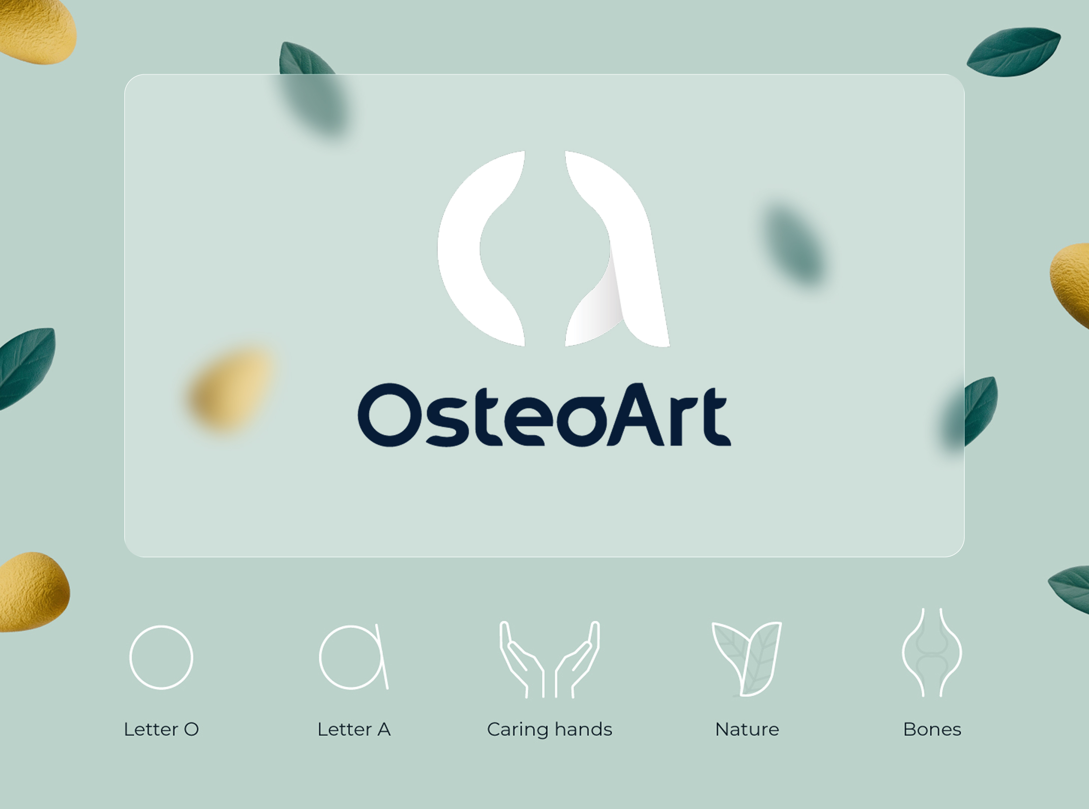
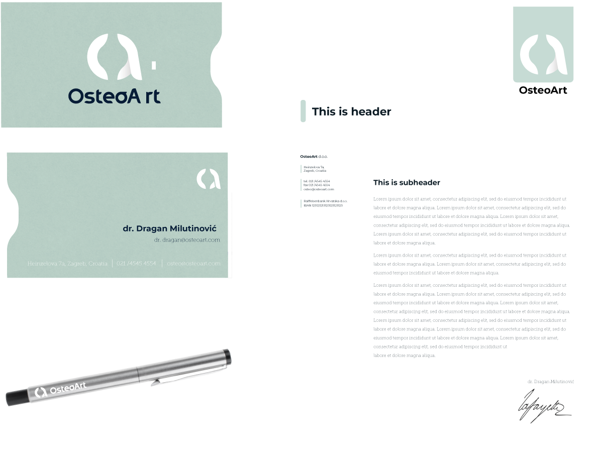
At its core, the visual mark merges clinical reliability with natural care. Its central form weaves the letterforms ‘O’ and ‘A’ into an abstract silhouette—reflecting joint structure, supportive care, and natural ingredients in a single cohesive symbol.
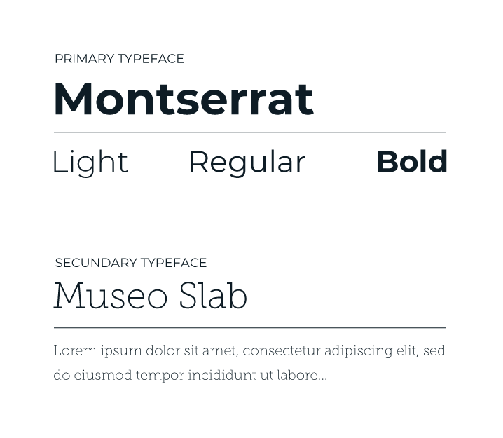
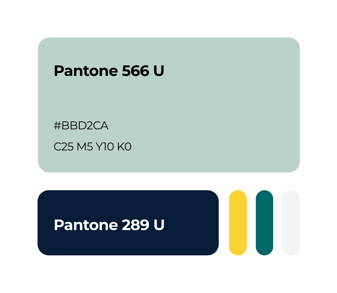
Pairing the clean geometry of Montserrat with the warm, expressive strokes of Museo bridges technical precision with personal care—balancing medical authority with an inviting tone. This carries directly into the color strategy, where a grounded primary base establishes trust while soft green and warm yellow accents highlight OsteoArt’s focus on natural ingredients.
osteo art ENVIRONMENTAL BRANDING


osteo art stationary

Musculoskeletal Healthcare Brand
OsteoArt
Deliverables
visual identity
PRINT PROMO MATERIALS
web page
ENVIRONMENTAL BRANDING
Concept
At its core, the visual mark merges clinical reliability with natural care. Its central form weaves the letterforms ‘O’ and ‘A’ into an abstract silhouette—reflecting joint structure, supportive care, and natural ingredients in a single cohesive symbol.
Pairing the clean geometry of Montserrat with the warm, expressive strokes of Museo bridges technical precision with personal care—balancing medical authority with an inviting tone. This carries directly into the color strategy, where a grounded primary base establishes trust while soft green and warm yellow accents highlight OsteoArt’s focus on natural ingredients.
osteo art ENVIRONMENTAL BRANDING
osteo art stationary
Musculoskeletal Healthcare Brand
OsteoArt
Deliverables
visual identity
PRINT PROMO MATERIALS
web page
ENVIRONMENTAL BRANDING
Concept
At its core, the visual mark merges clinical reliability with natural care. Its central form weaves the letterforms ‘O’ and ‘A’ into an abstract silhouette—reflecting joint structure, supportive care, and natural ingredients in a single cohesive symbol.
Pairing the clean geometry of Montserrat with the warm, expressive strokes of Museo bridges technical precision with personal care—balancing medical authority with an inviting tone. This carries directly into the colour strategy, where a grounded primary base establishes trust while soft green and warm yellow accents highlight OsteoArt’s focus on natural ingredients.
osteo art ENVIRONMENTAL BRANDING
osteo art stationary